Kelly and I have chosen 4 possible font styles for the artists name;

- This font style is simple and eye-catching because of it's widely set letters. A similar font style has been used in popular teen programmes for example 'The Hills' for the opening titles and other titles within the programme. It's contemporary style and feature in popular teen programmes will appeal to our target audience of 16-24 year olds. Also teenagers who watch 'The Hills' and other programmes that use this font style may subconsciously associate the TV programme with this artist due to the font style. This would help to promote sales of the digipak because it is aimed at a very similar target audience.

- This font style is simple and has bold hints in the font style and so doesn't need to have the bold added to it. The font for the artists name doesn't need to be over-complicated and needs to stand out at the same time so this font will do that job nicely.

- This font style is quite funky and is also in bold so that it would stand out and would catch the target audiences eye. This font has been used in the title sequence for the popular teen drama 'One Tree Hill'. Like the first font, teenagers who watch this programme will subconsciously associate the font style in the title sequence with the artist we are promoting. If they like the programme they will find themselves drawn to the digipak due to the font style of the artists name. This would help to promote the sale of digipak versions of the artists album.

- This font style is different from the usual fonts for the artists name on the fronts of CD covers and digipaks however it is eye-catching and the bold effect helps it to stand out.
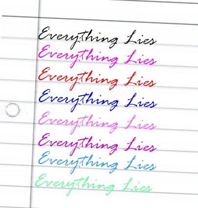
Kelly and I have chosen 4 possible font styles for the title of the digipak;

- I have grouped all 4 of these font styles because they are quite similar to each other and we want to portray a certain image with the font used for the name of the digipak. The font styles chosen are all quite feminine and each could be like hand-writing - we want the album title to look like it has been hand-written by the artist and then this font will also be used for the song titles on the back cover of the digipak.
The two font styles we have chosen for our digipak and poster are;

- Kelly and I have chosen his font style for the artists name because it is simple and eye-catching due to the widely set lettering. Also a similar font style has been used in popular teen programmes for example 'The Hills' for the opening titles and other titles within the programme. It's contemporary style and feature in popular teen programmes will appeal to our target audience of 16-24 year olds. Also teenagers who watch 'The Hills' and other programmes that use this font style may subconsciously associate the TV programme with this artist due to the font style. This would help to promote sales of the digipak because it is aimed at a very similar target audience.

- Kelly and I have chosen this font style for the album title and the song titles on the back cover of the digipak because firstly it looks like someone has just wrote it which is the look we want to go for - to make the artist look authentic, more realistic, and will help the audience to relate to the artist as it will be more believable that she wrote the lyrics herself. Also because the font is on a slant, joined up and has a few curls in it, it gives a feminine look to the album name which will appeal to the females in our target audience of 16-24 year olds.
Colours for the song titles on the back cover;
No comments:
Post a Comment