The front cover - Extreme close up/close up of female.
Middle left - Female holding last petal - sitting in a field.
Inlay - Collage or a single rose
Middle right - Female leaning against a wall holding a rose - bright white light behind her OR a collage
Back cover - the background will be a letter - lined paper - the song names will be in a hand-writing type font to make it look like she has hand-written the back cover - makes it more personal.
Sketches and final ideas for the digipak will be scanned in soon.
Basic Ideas for one of the middle covers:

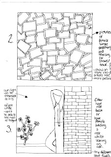
Audience feedback on which middle cover they preferred & why:
- Number 2 - looks interesting.
- Number 3 - more designs.
- Number 2 - tells audience more about the artist.
- Number 3 - attracts attention.
- Number 2 - raw - how you would expect to see artist - has meaning.
- Number 3 - looks good.
- Number 2 - I like it.
- Number 3 - shows mood.
- Number 2 - almost like scrapbook - goes with back cover of lined paper.
- Number 2 - it's different.
- Number 3 - like folwers and think it will look good.
- Number 3 - looks better.
- Number 3 - likes idea of bright light - more simple.
- Number 2 - looks good - change from big pictures on front etc. - different.
- Number 2 - different - so many effects and meanings.
- Number 1 - photo being dropped in storyboard - reflects story - going through pics etc. - people can relate to it - goes with the song.
- Number 2 - pictures of the singer being a singer.
We have decided to select design 3 to develop for one of the middle covers because even though design 2 was more popular we selected that to be a design for the inlay instead, and the middle covers will have a design which involved a rose - so we selected design 3 which was the 2nd most popular to develop.
Developed ideas for one of the middle covers:
Audience feedback on which middle cover they preferred & why:
- Number 1 - closer - looks good.
- Number 1 - better.
- Number 2 - looks better - further away - see more of picture - know what they're looking for.
- Number 1 - better as a close up photo.
- Number 1 - closer - looks better.
- Number 1 - fills more space - more detail - see rose better.
- Number 1 - more detail - fell more involved with picture.
- Number 1 - closer - see more/more detail.
- Number 1 - fills more space.
- Number 1 - fills space.
- Number 1 - sort of close-up see person better.
- Number 1 - bigger, eye-catching.
- Number 2 - see more - more detail.
We have decided to choose design 1 for our final design because it was the most popular with the target audience and there would be less space left around the image of the artist for the audience to get distracted by.
Ideas for the inlay:

Audience feedback on inlay & other comments (some are repeated because people said the same things):
- Before the idea of the collage:
- A black background with a bright pink/red rose would look good.
- A black background with a bright pink/red rose.
- Rose is good.
- Rose is a very nice idea - goes well with the theme. After the idea of the collage:
- A collage would be a good idea - better than the rose.
- A rose - it matches the back cover & maybe middle cover.
- A rose - so it matches the rest of the covers.
- The rose - it goes with the music video and rest of the album.
- Collage - about female singer - tells audience about what she did on tour - interests audience.
- Collage - you would still be able to see it when the CD/DVD is in place.
- Collage - is a good idea.
- Collage - would look good with all the different pictures of the artist - would look good if you tint the picture with just one colour or something.
- Collage - fills page - fuller - more meaning.
- Collage - good to see all of the differet pictures.
We have decided to have design 2 for the inlay because not only was it quite popular, it also links in with the back cover as a kind of scrap book image to make it more personal. Also for the two middle covers we are having images with roses in so we thought we would do something different for the inlay to keep the audiences attention.
Basic Ideas for the back cover:
 Audience feedback on which basic design they preferred for the back cover & other comments:
- Number 1 - good basis for back cover - unique.
- Number 1 - different from the others - more like a back cover.
- Number 1 - simply tells you the track list etc.
- Number 1 - simple - easy on the eye.
- Number 1
- Number 1 - just like it - more feminine.
- Number 1 - tells everything you need to know.
- Number 1 - like it - paper idea is good.
- Number 1 - simple but effective.
- Number 2 - see face better & the artist is shown
- Number 2 - see face of singer - more connective to them.
- Number 3 - artist shown & space for tracklist.
- Number 3 - not bland - nice design.
- Number 3 - cause I said.
- Number 1 - like picture - personal.
- Number 2 - looks active - interesting.
- Number 2 - looks most appealing.
- Number 1 - different - not a picture of artist.
- Number 1 - different - graphics could be put on - sketches.
- Number 1 - funky
We have decided to develop ideas for design number 1, firstly because it was the most popular design when we asked people for feedback on which they preferred/looked better as a back cover and also it is the one which can be developed quite a lot.
Developed Ideas for the back cover:

Audience Feedback on which developed idea they liked, why and other suggestions if any:
- Number 1 - like the rose & doodles - people can relate to doodles - more personal. Also you could put more doodles on it or add the fluffy pen to this one.
- Number 1 - like the rose.
- Number 1 - like the rose.
- Number 1 - shows female singer on a personal level.
- Number 1 - take more seriously.
- Number 1 - more feminine.
- Number 1 - suits the mood of the song.
- Number 1 - pretty flower (rose).
- Number 1 - more mature - symbolises love.
- Number 1 - flower more effective than fluffy pen.
- Number 1 - rose = pretty.
- Number 1 - love song & rose go together.
- number 1 - more design, delicate.
- Number 1 - looks better
- Number 1 - better.
- Number 1 - reminds them of love & it looks pretty.
- Number 2 - more realistic.
- Both - try to combine the ideas.
- Number 1 - flower & heart are prettier.
- Number 2 - fluffy pen - looks fun.
- Number 1 - goes with story & music video.
We are selecting design number 1 to have as our final design for the back cover of the digipak because it was the most popular design with our target audience.
No comments:
Post a Comment