Sunday, 22 November 2009

Shooting Schedule for music video and pictures for didgpak/poster

Filming for the music video;

Day One; - (completed)
Location: Tom bee's house & Winchester Road
Props: Paper saying 'Everything Lies' - to stick on road signs whilst filming.
Shot Numbers: 67, 69, 71, 73, 75, 77, 79, 80, 81, 82 84, 85, 86, 88, 90, 92, 94, 123


Day Two; - (completed)
Location: The college theatre - need to see when it is free & we need to book it
Props: Microphone, Mic stand, drums.
- A lighting schedule will also be produced for when we film in the theatre.
Shot Numbers: 1, 6, 14, 17, 18, 22, 23, 24, 25, (26, 27, 28, 29 filmed continuously) 31, 33, 35, 37, 38, 40, 42, 43, 59, 60 ,61, 62, 63, 64, 65 ,66, 68, 70, 72, 74, 76, 78, 87, 89, 91, 93, 95, 98, 99, 100, 101, 102, 103, 104, 105, 106, 107, 108, 109, 111, 112, 113, 114, 115, 119, 120, 121, 122, 123, 124, 125, 126, 127, 128, 129, 130, 131, 132.

Camera shots filmed of the Female singer (me) performing from the same positioning and each shot type they will be from:
Extreme close up of lips: 26, 27, 28, 29
Close up: 14, 17, 33, 38, 70, 78, 89, 93, 107, 120
Medium close up: 1, 25, 42, 60, 62, 65, 95, 98, 112, 129
Medium shot: 6, 24, 35, 47, 61, 63, 74, 91, 99, 103, 126,
Medium-long shot: 23, 37, 43, 64, 66, 130, 132
Long shot: 18, 22, 68, 72, 87, 114, 124

Shots of Female 2 (Kelly) in the theatre: 96, 99, 101, 106, 114, 119, 125


Day Three; - (completed)
Shots of the Male in the theatre: 97, 102, 104, 108, 111, 115, 121, 128, 131

Shots of just the audience (without male): 100, 113,


Day Four; - (completed)
Location: Drama studio - need to see when free & need to book it
Props: Green fabric for greenscreening & digital camera to take a picture before filming one perticular shot - not really props but we need them
Shot numbers: 3, 12, 77, 80, 81, 116
Camera shots filmed from the same position: 3 & 116

Day Five; - (completed)
Location: Countesthorpe/Leysland field & outside the entrance to design
Props:
Shot Numbers: 26, 27, 28, 30, 32, 34, 36, 39, 41, 44, 45, 46, 110, 117


Day Six; - (completed)
Location: Countesthorpe gym - need permission to film whilst people are in there - we need things going on in the background anyway so we don't need an empty gym
Props: Gym equiptment, bench
Shot Numbers: 13, 15, 16, 50, 51, 53, 54, 55, 56, 57, 58, 118

Day Seven; - (completed)
Location: Kelly's house
Props: Photo's, letters, bed, mirror, make-up
Shot Numbers: 5, 7, 8, 9, 10, 19, 20 ,21, 83


Still images needed for our music video:
Shots 2, 3, 4, 11 and 116 all will need pictures as the full shot or the background.

  • For shots 2 and 4 the still images are the same - the picture was taken & edited (cropped and tinted black & white) on the 23rd of November 2009.
  • For shots 3 and 116 the background still images are the same - the picture was taken & edited (cropped and tinted black & white) on the 23rd of November 2009.
  • The picture need for shot 11 will be taken just before we film shot 12 as they follow on from each other & it will be easier to get the positioning right. - the picture & the shot following it were both taken & filmed on the 2nd of December 2009.

Dates of when filming has taken place:

  • 24th November - completed all of day 4's filming - couldn't do days 1,2 or 3 because of the weather and the theatre was booked.
  • 26th November - completed shots 67, 69, 71, 73, 75, 77, 79, 80, 81, 82 84, 85, 86, 88, 90, 92, 94 from day 1 of filming - need to re-shoot shot number 92 because we decided we need to cover up another sign as that was standing out more than our sign & we need to re-do the poster because the wrong phrase was used. We will film shot 92 on the day we film when we start filming the shots in day 5 in our shooting schedule.
  • 2nd December - completed shots 5, 7, 8, 9, 10, 11, 12, 13, 15, 16, 50, 51 & 57 - most of the filming for day 7 is completed and part of day 6 is completed.
  • 3rd December - completed shots 52, 53, 54, 55, 56, 58 & 118 - all of the filming for Day 6 is completed.
  • 9th December - completed shots 32, 34, 36 & 110.
  • 10th December - completed shots 26, 27, 28, 30, 82, 84 & we re-shot shot number 92 which was successful..
  • 16th December - completed shots 39, 41, 117
  • 18th December - completed shot 123
  • 7th January - completed shots, 1, 6, 14, 17, 24, 25, 33, 35, 38, 42, 60, 61, 62, 63, 65, 70, 74, 78, 89, 91, 93, 95, 103, 107, 112, 120, 129
  • 15th January - completed shots, 100, 104, 108, 111, 113, 115, 121, 128
  • 29th January - completed the rest of Day 2 filming
  • 4th March - completed the rest of Day 3 filming
  • 11th March - completed 4 shots in the place of shots 19, 20 & 21 --> Day 7 of filming is completed :) - we changed these shots because we don't have enough time to experiment with split screen editing so we have just added some more narrative into the music video and the shots will be on the beat.

All filming is finished :D


Still images for the digipak & poster;


  • Close up/medium-close up of female singer (me) for the front cover - may be taken before or after we have filmed in the theatre. (day two)
  • A piece of lined paper will be scanned onto a computer for the base of the back cover - will be scanned when we scan the storyboards and digipak/poster sketches onto the computer.
  • Take a picture of a rose when we are filming with the rose (day five) - for the back cover.
Dates of when the still images have been taken;
  • December 15th - lined paper was scanned onto the computer
  • December 16th - The picture of the rose was taken (for the back cover) and the picture of the artist with the rose was taken (for one of the middle covers) - it was altered slightly.
  • January 5th - Pictures were taken of me holding a rose - for the digipak.
  • January 8th - A lot of pictures were taken of me (the singer) whilst "performing" & also a few other different settings - all for the digipak and poster - we will need to choose which ones we will be using.
  • February 24th - we set up a proper photoshoot in the media room with three point lighting and a white/cream backdrop and took quite a few photo's. These will be for the collage, poster and maybe a middle cover of the digipak.
  • March 9th - Pictures were taken of me for the inlay collage for the digipak.

Wednesday, 18 November 2009

Planning for the Digipak

Kelly and I have come up with the following overall ideas for our digipak;

The front cover - Extreme close up/close up of female.
Middle left - Female holding last petal - sitting in a field.

Inlay - Collage or a single rose
Middle right - Female leaning against a wall holding a rose - bright white light behind her OR a collage
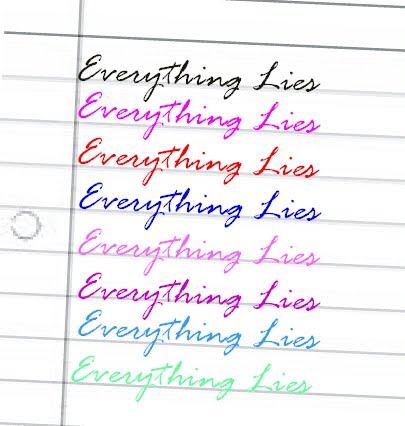
Back cover - the background will be a letter - lined paper - the song names will be in a hand-writing type font to make it look like she has hand-written the back cover - makes it more personal.


Sketches and final ideas for the digipak will be scanned in soon.

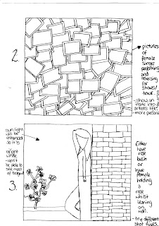
Basic Ideas for one of the middle covers:


Audience feedback on which middle cover they preferred & why:
  • Number 2 - looks interesting.
  • Number 3 - more designs.
  • Number 2 - tells audience more about the artist.
  • Number 3 - attracts attention.
  • Number 2 - raw - how you would expect to see artist - has meaning.
  • Number 3 - looks good.
  • Number 2 - I like it.
  • Number 3 - shows mood.
  • Number 2 - almost like scrapbook - goes with back cover of lined paper.
  • Number 2 - it's different.
  • Number 3 - like folwers and think it will look good.
  • Number 3 - looks better.
  • Number 3 - likes idea of bright light - more simple.
  • Number 2 - looks good - change from big pictures on front etc. - different.
  • Number 2 - different - so many effects and meanings.
  • Number 1 - photo being dropped in storyboard - reflects story - going through pics etc. - people can relate to it - goes with the song.
  • Number 2 - pictures of the singer being a singer.

We have decided to select design 3 to develop for one of the middle covers because even though design 2 was more popular we selected that to be a design for the inlay instead, and the middle covers will have a design which involved a rose - so we selected design 3 which was the 2nd most popular to develop.

Developed ideas for one of the middle covers:

Audience feedback on which middle cover they preferred & why:

  • Number 1 - closer - looks good.
  • Number 1 - better.
  • Number 2 - looks better - further away - see more of picture - know what they're looking for.
  • Number 1 - better as a close up photo.
  • Number 1 - closer - looks better.
  • Number 1 - fills more space - more detail - see rose better.
  • Number 1 - more detail - fell more involved with picture.
  • Number 1 - closer - see more/more detail.
  • Number 1 - fills more space.
  • Number 1 - fills space.
  • Number 1 - sort of close-up see person better.
  • Number 1 - bigger, eye-catching.
  • Number 2 - see more - more detail.

We have decided to choose design 1 for our final design because it was the most popular with the target audience and there would be less space left around the image of the artist for the audience to get distracted by.


Ideas for the inlay:


Audience feedback on inlay & other comments (some are repeated because people said the same things):

    Before the idea of the collage:
  • A black background with a bright pink/red rose would look good.
  • A black background with a bright pink/red rose.
  • Rose is good.
  • Rose is a very nice idea - goes well with the theme.
  • After the idea of the collage:
  • A collage would be a good idea - better than the rose.
  • A rose - it matches the back cover & maybe middle cover.
  • A rose - so it matches the rest of the covers.
  • The rose - it goes with the music video and rest of the album.
  • Collage - about female singer - tells audience about what she did on tour - interests audience.
  • Collage - you would still be able to see it when the CD/DVD is in place.
  • Collage - is a good idea.
  • Collage - would look good with all the different pictures of the artist - would look good if you tint the picture with just one colour or something.
  • Collage - fills page - fuller - more meaning.
  • Collage - good to see all of the differet pictures.

We have decided to have design 2 for the inlay because not only was it quite popular, it also links in with the back cover as a kind of scrap book image to make it more personal. Also for the two middle covers we are having images with roses in so we thought we would do something different for the inlay to keep the audiences attention.


Basic Ideas for the back cover:

Audience feedback on which basic design they preferred for the back cover & other comments:

  • Number 1 - good basis for back cover - unique.
  • Number 1 - different from the others - more like a back cover.
  • Number 1 - simply tells you the track list etc.
  • Number 1 - simple - easy on the eye.
  • Number 1
  • Number 1 - just like it - more feminine.
  • Number 1 - tells everything you need to know.
  • Number 1 - like it - paper idea is good.
  • Number 1 - simple but effective.
  • Number 2 - see face better & the artist is shown
  • Number 2 - see face of singer - more connective to them.
  • Number 3 - artist shown & space for tracklist.
  • Number 3 - not bland - nice design.
  • Number 3 - cause I said.
  • Number 1 - like picture - personal.
  • Number 2 - looks active - interesting.
  • Number 2 - looks most appealing.
  • Number 1 - different - not a picture of artist.
  • Number 1 - different - graphics could be put on - sketches.
  • Number 1 - funky

We have decided to develop ideas for design number 1, firstly because it was the most popular design when we asked people for feedback on which they preferred/looked better as a back cover and also it is the one which can be developed quite a lot.


Developed Ideas for the back cover:


Audience Feedback on which developed idea they liked, why and other suggestions if any:

  • Number 1 - like the rose & doodles - people can relate to doodles - more personal. Also you could put more doodles on it or add the fluffy pen to this one.
  • Number 1 - like the rose.
  • Number 1 - like the rose.
  • Number 1 - shows female singer on a personal level.
  • Number 1 - take more seriously.
  • Number 1 - more feminine.
  • Number 1 - suits the mood of the song.
  • Number 1 - pretty flower (rose).
  • Number 1 - more mature - symbolises love.
  • Number 1 - flower more effective than fluffy pen.
  • Number 1 - rose = pretty.
  • Number 1 - love song & rose go together.
  • number 1 - more design, delicate.
  • Number 1 - looks better
  • Number 1 - better.
  • Number 1 - reminds them of love & it looks pretty.
  • Number 2 - more realistic.
  • Both - try to combine the ideas.
  • Number 1 - flower & heart are prettier.
  • Number 2 - fluffy pen - looks fun.
  • Number 1 - goes with story & music video.

We are selecting design number 1 to have as our final design for the back cover of the digipak because it was the most popular design with our target audience.

Monday, 16 November 2009

Font styles and colours for the digipak and poster

Kelly and I have chosen 4 possible font styles for the artists name;


  • This font style is simple and eye-catching because of it's widely set letters. A similar font style has been used in popular teen programmes for example 'The Hills' for the opening titles and other titles within the programme. It's contemporary style and feature in popular teen programmes will appeal to our target audience of 16-24 year olds. Also teenagers who watch 'The Hills' and other programmes that use this font style may subconsciously associate the TV programme with this artist due to the font style. This would help to promote sales of the digipak because it is aimed at a very similar target audience.

  • This font style is simple and has bold hints in the font style and so doesn't need to have the bold added to it. The font for the artists name doesn't need to be over-complicated and needs to stand out at the same time so this font will do that job nicely.

  • This font style is quite funky and is also in bold so that it would stand out and would catch the target audiences eye. This font has been used in the title sequence for the popular teen drama 'One Tree Hill'. Like the first font, teenagers who watch this programme will subconsciously associate the font style in the title sequence with the artist we are promoting. If they like the programme they will find themselves drawn to the digipak due to the font style of the artists name. This would help to promote the sale of digipak versions of the artists album.

  • This font style is different from the usual fonts for the artists name on the fronts of CD covers and digipaks however it is eye-catching and the bold effect helps it to stand out.


Kelly and I have chosen 4 possible font styles for the title of the digipak;


  • I have grouped all 4 of these font styles because they are quite similar to each other and we want to portray a certain image with the font used for the name of the digipak. The font styles chosen are all quite feminine and each could be like hand-writing - we want the album title to look like it has been hand-written by the artist and then this font will also be used for the song titles on the back cover of the digipak.

The two font styles we have chosen for our digipak and poster are;


  • Kelly and I have chosen his font style for the artists name because it is simple and eye-catching due to the widely set lettering. Also a similar font style has been used in popular teen programmes for example 'The Hills' for the opening titles and other titles within the programme. It's contemporary style and feature in popular teen programmes will appeal to our target audience of 16-24 year olds. Also teenagers who watch 'The Hills' and other programmes that use this font style may subconsciously associate the TV programme with this artist due to the font style. This would help to promote sales of the digipak because it is aimed at a very similar target audience.


  • Kelly and I have chosen this font style for the album title and the song titles on the back cover of the digipak because firstly it looks like someone has just wrote it which is the look we want to go for - to make the artist look authentic, more realistic, and will help the audience to relate to the artist as it will be more believable that she wrote the lyrics herself. Also because the font is on a slant, joined up and has a few curls in it, it gives a feminine look to the album name which will appeal to the females in our target audience of 16-24 year olds.


Colours for the song titles on the back cover;


Friday, 16 October 2009

Practicing Green Screen

You should really watch this video on mute! Mainly because its really repetitive and we forgot to mute the sound in editing.

In the clip below there are examples of 3 different uses of lighting against different backgrounds to see which type of lighting and which colour/texture of the background it will look the best against.

We have repeated the 3 different green screen clips on different backgrounds so the sound will be repetitive and sound a bit muddled but we aren't looking at the sound so it's ok.


We have found that using as much lighting as possible on the main figure when shooting against a green screen and then layering those shots on top of darker backgrounds gives the best effect and won't be as noticeable to an audience if used in this way in mine and Kelly's music video.

Kelly and I have decided to use the green screen technique in the music video. The shot will be of a photo of a boy and the singer and the singer will come to life and start singing. The photo will be in black and white so that any interference when shooting the green screen shots won't be noticeable. However if it is noticeable we will try altering the texture and colour tint of the photo until we get the best results we can.

Tuesday, 13 October 2009

Planning for the music video

Firstly, we searched for the lyrics of the song, which are;

Everything Lies lyrics

Don't hide behind that pretty face of yours
You've got everyone believing that you would never be this deceiving, pretty eyes
I can see through all the lies you tell
That sweet exterior is what you were
And now you are becoming something new

And I can be broken just as you now seem to be
And well you should go on now but it will have to be without me
Cause everything lies between you and me

You think this song is all about you
You say I've done all the changing while I'm watching all your rearranging, silly boy
You seem to constantly out do yourself
Why don't you admit that you're not fit to try to run a race against me, yeah

And I can be broken just as you now seem to be
And well you can go on now but it will have to be without me
Cause I can be broken just as you now seem to be
And well you can go on now but it will have to be without me
Cause everything lies between you and me

See everything lies
between you and me
Everything lies
Ohhh
Everything lies between you and me

You can go on now but it will have to be without me
And, I can be broken just as you now seem to be
And well you can go on now but it will have to be without me
Cause I can be broken just as you now seem to be
And well you can go on now but it will have to be without me
Cause everything lies
Everything lies
Everything lies
Between you and me

We have interpreted the lyrics to be about a girl who had a boyfriend who was quite 'full of himself', messed her around and possibly cheated on her, so she left him and now he may be regretting the way he acted towards her.


General ideas for the music video;
  • Some of the edits are going to be on the beat and some are going to be edited to the lyrics - so we can emphasise certain phrases and lyrics within the song.
  • The music video will be co-dominated by a narrative and performance, the verses will be dominated by the narrative and have some aspects of performance in them whereas the chorus will be dominated by performance and have some narrative incorporated. Towards the end of the song there will be a balance of both.
  • The basic structure of the narrative will be losely based on Tzvetan Todorov's narrative theory. The first stage, which is equilibrium will be shown in the first verse, where the female singer and the male are a happy couple. The second stage, which is the equilibrium will be disrupted will be shown in the second verse, the male cheats on the female singer with another girl. The final stage is a new equilibrium is produced, this will be shown when the female singer breaks up with the male. This links to Andrew Goodwin's theory of conflict being restored. We are going to show within the music video the female walking away from the male, as the music has a closing beat to it after the slight change in it and lyrically the words "Everything Lies" are repeated, as borrowed from the chorus.

Casting for the music video;

  • Main parts - Charlotte (me) as the female singer (also referred to as female 1), Kelly as female 2, Tom Bee as the male.
  • Extra's are still to be decided and asked.

Locations for the music video;

  • Countesthorpe community college's - theatre, drama studio, infront of design, and the field which is shared with leysland.
  • Winchester Road.
  • Tom Bee's house, infront of his house & on his road (the pathway on his road).
  • Kelly's house.

Props and things we need;

  • Video camera, digital camera, tripod, a dolly, greenscreen fabric, duck tape, make-up, a rose (maybe more than one), several photo's of me & tom, pieces of paper which are made to look like letters, brush, gel/wax, microphone & stand, a drum kit, a sign saying 'Everything Lies' on it, two A4 sized pictures of me and Tom, gym equiptment, mobile phone.

The actors in our music video will be wearing a variety of different clothes throughout which isn't demonstrated by the images.


Storyboard:


Audience feedback after they had listened to our song & read/looked at our storyboard & any advice:

  • I think it's good, well planned, take time filming - so it will live up to what you want it to be.
  • Detailed and well planned.
  • Detailed, it fits to the song - could do a little selection of storyboard - filmed & edited to show people an example.
  • It's good, goes with song well
  • Story sounds good, goes with song cause it's angry.
  • Looks good - likes blended lips with other shots.
  • It's good - asked how long it took to put the storyboard together.
  • Really good.
  • It's very interesting & It will keep everyone interested - there's a lot going on. When I first heard the song I thought of just two people being involved however after looking at the storyboard, it goes well & the storyline is better with a 3rd person - like a love triangle.
  • I like it - it goes with the story - you & others should make it look convincing, & look like your taking it seriously but have fun & try not to laugh when acting unless your meant to.

Tuesday, 6 October 2009

Summary and Conclusion of research for music video's, digipaks/CD's, and relevant posters

Overall, I found that there were clear links between the digipak/CD covers, music videos and relevant posters of most of the artists I researched. However with 'The Killers' genre of alternative/rock music, the CD cover didn't really link in with either of the music video's for their debut single released from 'Hot Fuss' and there was only one real link between the CD cover and the newspaper advert. On the other hand with 'Mcflys' genre of pop/rock music there were clear links between the digipak, the music video for the debut single released from 'Radio:Active' and the tour poster. This was due to there being a single image presented in or on all three media products along with other, more subtle representations of images. Also with 'The Hoosiers' genre of indie music there were a few links between the CD covers, music video for the debut single released from 'The trick of life' and tour poster. This was due to mainly there being one version of a logo for the band's name which was present in and on all three media products and also there were other images and representations which crossed over the three media products as well.
  • 'The Killers', 'Mcfly' and 'The Hoosiers' all had performance elements in their music video's, this is due to them being a typical 'band' meaning they all have an instrument/instruments they play as part of their performance for example guitars, bass guitars and drums are typical of a band in this sort of genre. It may just be that as one of the conventions of the rock or indie genres they have to show a performance of their band in the music video. This suggests that if I was to choose a song from the rock or indie genres then it would be conventional to have a music video dominated with performance and if I wanted I could incorporate other genres of music video into it for example abstract images.

With the 'Black Eyed Peas' genre of r'n'b/dance music there were very clear links between the CD covers, music video for their debut single from 'The E.N.D' and the tour poster. This was because the same theme had been used in and on all three music videos for example the theme of a computerised world.

  • The 'Black Eyed Peas' had a mostly abstract video which seemed to be dominated by lip-syncing and shots of people dancing (but it's not really classed as performance) this is because the genre of music they are associated with concentrates more on the artist and their vocals rather than them playing an instrument. The shots of people dancing in the music video may just be a convention of the dance genre. This suggests that if I was to choose a song from the dance genre then it would be conventional to have shots of lip-syncing and shots with dancing in them. Also it may help to have an abstract video however it does depend on the meaning of the song and if an abstract video would be appropriate.

With 'Beyoncés' genre of r'n'b/soul music there were very clear links between the CD covers, the music video for her debut single from 'I Am... Sasha Fierce' and a poster advertising the CD. This was due to mainly the mise-en-scene used for the shots and image of each and the edits to alter the colour to a grey tint instead.

  • 'BeyoncĂ©' had a narrative based music video and shots of lip-syncing weren't displayed until it was nearly the end of the song. This gave emphasis to the narrative throughout the song and then at the end the lyrics were the focus of emphasis. This is a unique example of a music video for the r'n'b/soul genre. However it does suggest to me that a narrative is more likely to be used inbetween shots of lip-syncing. So if I was to choose a piece of music which was within the r'n'b/soul genre it would be an idea to use a narrative and lip-syncing in the music video.

With 'Kelly Clarksons' genre of pop/rock vocalist music I looked to see if the music video for the fourth song released from her album still linked in with her CD covers and tour poster. I found that there wasn't really a clear link between the music video and the CD covers/tour poster. However there were still very clear links between the European album cover and the tour poster (which happened to be for somewhere in Europe). This shows to me that the link between a debut singles' music video and other promotional work isn't continued into the singles released after for example the fourth single released.

  • 'Kelly Clarkson' had a narrative based music video where there were shots of lip-syncing between some shots of the narrative. The verses were dominated by the narrative but had some shots of lip-syncing in and the chorus' were dominated by lip-syncing but had some shots of the narrative in it. This suggests that if I were to choose a song from the pop/rock genre and they were a female soloist it may be a good idea to use a mixture of a narrative and lip-syncing in the music video for the song.

Wednesday, 23 September 2009

Research into the song choice for the music video

  • I have been looking for quite a specific type of sound to the track in which will be the chosen song for the music video. It needs to have female vocals due to Kelly & I being an all female group and one of us will be featured in the music video by lip-syncing. Also it needs to be an upbeat song so we will be able to come up with a variety of shots and have a quick pace to keep an audience interested.
  • First of all I looked up a bit about what Creative Commons was all about instead of jumping straight into looking for music.
    The following quotes were taken from; http://creativecommons.org/about/what-is-cc
    "It was set up to increase the amount of creativity that is available to the public - which will be free and legal."
    "Creative Commons licenses are not an alternative to copyright. They work alongside copyright, so you can modify your copyright terms to best suit your needs."
    Also "Creative Commons defines the spectrum of possibilities between full copyright and the public domain. From all rights reserved to no rights reserved. Our licenses help you keep your copyright while allowing certain uses of your work — a “some rights reserved” copyright."
    - I found this quite interesting as some people are able to still have a copyright on certain aspects of their work.
    Creative Commons do also use the website Jamendo as one of their 'servers' for copyright free music from all over the world. This enables the public to listen to, download and use the music for free. I have browsed and listened to quite a few tracks from the Jamendo server on the Creative Commons website and so far I have't found any which have appealed to me. I have also had difficulty finding many which have females vocals which are in the english language (as we do have to lip-sync and it would be harder if the song was in a different language).
  • I then researched unsigned artists on www.google.co.uk and browsed a few websites which came up on the results - one of which was: www.unsigned.com so far I have found one artist which has a song which I will be considering and will need to ask Kelly about. The song is called "Everthing lies" by Amanda Kaletsky which can be heard on the link - http://www.unsigned.com/amandakaletsky
    The artist is unsigned as she is using an unsigned website to promote her music and it looks like her music is copyright free.
  • There are quite a few songs from this artist so I'm undersided on just one yet, the link for the artist (Sarah from Leicester) is http://www.unsigned.com/000sarahbird I have found a myspace page for this artist so I may try to contact them, however first I will see what Kelly thinks because we could ask Sarah to star in the music video depending on which artist and song we choose. Her music appears to be copyright free also and she is an unsigned artist.
  • Another song to be considered is called "It Kills Me" by Jenna Webb and the link is; http://www.unsigned.com/jennawebb

Kelly and I have decided to produce a music video to the song, "Everything Lies" by Amanda Kaletsky.

I have e-mailed her on myspace and hotmail jut to check if it's alright to use her song as our music video however as it stands she hasn't replied yet.

Audience Feedback on the song choice and answers to the questions we asked:

1. What genres of music do you listen to?
2. What genre does the song fall under?
3. What do you think of the song?

  • 1. Pop, R'n'B, Dance 2. Pop 3. Good, it says what most girls are feeling but at the same time it has got a good beat.
  • 1. Pop, R'n'B, Dance, Rock, Pop rock, 80's 2. Pop 3. I think it's good and it has a good storyline already hidden in the lyrics.
  • 1. Indie, drum and base. 2. Pop 3. It's ok, I like the singers voice.
  • 1. Pop, Indie-rock, R'n'B, Indie, Dance 2. Pop 3. I like it, I like the tempo and her voice.

Also my partner Kelly Bailey has taken a slightly different approach into researching people's opinions of the song for our music video. She asked 4 different groups of people to see if there were different views between the two genders and also if there was a difference in view of different ages as well. These are the responses from the 4 groups:


Teenage Females...
"ultimate revenge song love it!"
"Lyrics are good and catchy"
"Like the beat and instruments used"

Teenage Male...
"Artist has a good voice"
"It sounds to manufactured and generic,i weren't to keen but good for doing a narrative and music video too"
"Sexiest song to males but its catchy"

Middle-aged Woman ...
"Softness of music, lyrics and voice are lovely"
"Can visualise somebody, easy to relate to the song"
"A good beat in the background"

Middle-aged Male ...
"Good beat and voice, lyrics are good"
"Not enough musical instruments"
"Sings at one tone, tend to switch of"
"Same beat throughout the song no backing vocals"

In conclusion, both groups of females of different ages all gave positive feedback for the song however within the two male groups there were a few negative comments which suggests that the song will appeal more to women than to men, which meas we will take this into consideration when planning and making the music video, digipak and posters.

Also I found from my research that mostly people who listen to the "pop" genre of music generally liked the song. We figured that the song is a "pop" song and so did the people we asked. This suggests we will have to make a music video, digipak and poster which will appeal mostly to "pop" music fans.