Part 1;
Part 2;
Part 3;
Friday, 30 April 2010

Monday, 26 April 2010
Amanda Kaletsky e-mailed us on youtube about the music video! :D
"subject: love the video!
Hey Charli and Kelly,
A friend of mine stumbled across this video, just wanted to say it's great! We're going to post it on my website soon. Hope that's OK with you.
Thanks again, glad you like the song!
Amanda
www.amandakaletsky.com"
Hey Charli and Kelly,
A friend of mine stumbled across this video, just wanted to say it's great! We're going to post it on my website soon. Hope that's OK with you.
Thanks again, glad you like the song!
Amanda
www.amandakaletsky.com"
Friday, 19 March 2010
Music Video - Amanda Kaletsky - Everything Lies
I have uploaded the music video to youtube so we can get some audience feedback from a wider range of people not just people we know. I have uploaded it to youtube as our target audience is the core 15-24 age group who are consistant users of websites such as this.
Here is the link; http://www.youtube.com/watch?v=U2eZ1MZQJVg
Along with youtube I uploaded the music video to bebo as it is one of a few popular social networking sites for the 15-24 age group to go on.
Here is the link; http://www.bebo.com/c/video?FlashBoxId=10463743064
Unfortunately if you aren't a member of Bebo you can't access the comments on the music video. I have therefore created an account mainly for the use of Mike, the media teacher and any moderators who wish to access these comments.
Once the link has been opened scroll down and click on 'login to view comments' where it will ask you to provide a username and password.
Username: CharlotteL5183
Password: media2010
Facebook is also a very popular site for people ranging from teenagers to people in their middle ages. I have e-mailed a few contacts on facebook with the link to the music video and asked them what they thought. Some of the people couldn't comment through Blogger and the Google accounts so they e-mailed their views back to me on facebook;
- Laura Hyde 25 March at 22:14:
"omg ur a really good singer it's really good" - Emeline Rosanna Crossley 26 March at 16:47:
"hey cant comment on you tube but i love the music video. love when yooh run and the lips are moving. that looks really effective and dramatic. i think your in great timing with the music when you mime singing so it looks like your singing . i like when you tap your shoes on the floor its simple are very effective . hope that was what you were looking for i looked at it from a drama perspective." - Hannah Kate Charlesworth 26 March at 22:26:
"Heyyya I forgot my password soo I'll write it on here :) I thought it was really good :) And i really liked the song! The video went really well with the song. And i really got into it." - Roshni Patel 29 March at 09:48:
"Your video and covers are amazing!! Must have taken ages to do, but it's turned out really nice :)"
Final Posters
Designed and made by me:

I have e-mailed a few contacts on facebook with the link to the image of the poster and asked them what they thought. Some of the people couldn't comment through Blogger and the Google accounts so they e-mailed their views back to me on facebook;
I have e-mailed a few contacts on facebook with the link to the image of the poster and asked them what they thought. Some of the people couldn't comment through Blogger and the Google accounts so they e-mailed their views back to me on facebook;
- Hannah Kate Charlesworth 26 March at 22:26:
The poster is good and was like it was shot from the video. - Roshni Patel 29 March at 09:48:
Your video and covers are amazing!! Must have taken ages to do, but it's turned out really nice :)
Friday, 12 March 2010
Audience feedback for the music video
Kelly and I have nearly finished the music video, and we decided to ask people to watch it so far and see whether we need to change anything and what they thought of the pace of the shots etc.
We asked media and non-media students to see what technical aspects we could improve if any and to see if it appealed to people who didn't actually do media.
Non-media student feedback:
We asked media and non-media students to see what technical aspects we could improve if any and to see if it appealed to people who didn't actually do media.
Non-media student feedback:
- Ash Hallam - Pace good, don't need to change anything. liked how shots followed each other quickly, song fitted visuals.
- Matt PW - Agreed with what Ash said & understood what the song and narrative was about and what the message was.
- Georgie - Liked that the shots switched between lip-syncing and the narrative, the best bit of the music video was when Kelly and Charli were both singing at the end, wouldn't switch it over if it was on a music channel, loved pace.
- Tarnya - Everythings good, wouldn't switch over if it was on a music channel, loved the pace.
- Charley Bale - The visuals suit and go with the music and the beat of the music, it's well good, long takes suit slower pace of music in beginning (& slower narrative), shorter takes suit the faster pace of the music towards the end (narrative advances), nothing needs to be changed.
Media student feedback:
- They all said that the pace was good and shouldn't be changed, they understood the narrative and treated it like a bit of a soap opera, they enjoed watching the shots of the audience as they were quite comical - which was the intention, overall they thought it was really good.
Thursday, 11 March 2010
Progress of the Middle cover for the Digipak
There was only a few steps to making the middle cover, all of which are explained on the annotation of the image below:


Friday, 5 March 2010
Final Pieces for the Digipak :)
Front Cover, designed and made by Kelly:
 Back Cover, designed and made by me:

The two middle covers inside the digipak:
Made and designed by Kelly:

Spine, made and designed by me:

Net for digipak:

 Back Cover, designed and made by me:
The two middle covers inside the digipak:
Made and designed by Kelly:
Made and designed by me:
The inlay collage's for the CD and DVD inlay's:
Made and designed by me:
Spine, made and designed by me:

Net for digipak:

I have e-mailed a few contacts on facebook with the link to the images of the digipak and asked them what they thought. Some of the people couldn't comment through Blogger and the Google accounts so they e-mailed their views back to me on facebook;
- Emeline Rosanna Crossley 26 March at 16:47
love the front cover very simple but effective, love the picture with the rose its sweet and like the back cover the rose looks cute and innocent. - Hannah Kate Charlesworth 26 March at 22:26:
i like the back & front cover of the CD was really good, and looked very proffessional. If it was real i would buy it! Lol - Roshni Patel 29 March at 09:48:
Your video and covers are amazing!! Must have taken ages to do, but it's turned out really nice :)
Monday, 1 March 2010
Kelly Bailey's side to the production work :)
Kelly and I have been working on our media production work together. We decided that for the digipak Kelly would plan and make the Front Cover, one Middle Cover and one inlay and I would plan and make the Back Cover, one Middle Cover and one inlay. We are also going to plan and make one poster each. Kelly and I worked together to come up with a theme for the digipak, what fonts we were going to use and the general idea of what each cover would include on it.
We decided that we were going to have a re-occuring theme of a single white/pink rose which will be presented on the digipak, in the music video and possibly on the poster as well. The font we are using for the artists name is Century Gothic and for the title of the album and song titles we are using the font,
Each image has been annotated by Kelly to show how the image will be constructed and what it is she has drawn.
Kelly's Middle Cover ideas for the digipak:

Kelly:
"Starting from the bottom left hand image of flower, will be small and colourful and will be placed there to break up the artist forename and surname.
The forename of the artist to be big,bold capital letters, in a red/pink colour to show love.
Background colour to be dark and sparkly.
Three translated mirrowed images of artist, all images will be medium to close-up.
An image of a star to show a star in the making, be also coloured in a bright yellow.
Name of the single featured in the album 'Everything lies' in a red/pink font.
Big,bold capital letters of the surname of the artist in a red/pink font to show love.
I wanted to do all these images and colours to make this digipak stand out from the others."

The picture on the top left hand side has been downloaded from the internet however the rest of the images were hand drawn or made on the computer by Kelly.
Kelly:
"For the top left hand side poster image:
Its bright, broken heart (and the song 'Everything lies' is about a broken heart and loosing love.Could have a scroll with information on it.Artist picture featured in black box in the top left hand corner.
For the top right hand poster image:
Artist picture in left hand of broken heart.In right hand, information in it with a sky lue background to show innocense.Artist name at top of heart.
For the bottom left hand digipak image:
Looks as if the heart is shattered which shows that its a sad song and album.Pictures of the artist in close-ups in red part of heart.In white part, images of artist and male.Black part has various images of teddys, letters ect.
For the bottom right hand digipak image:
Background for Cd, a heart with a keyhole in it.Shows you have to unlock it so could show that the album is full of secrets and you have to unlock it (play the cd) to here them."
We decided that we were going to have a re-occuring theme of a single white/pink rose which will be presented on the digipak, in the music video and possibly on the poster as well. The font we are using for the artists name is Century Gothic and for the title of the album and song titles we are using the font,
Each image has been annotated by Kelly to show how the image will be constructed and what it is she has drawn.
Kelly's Middle Cover ideas for the digipak:

Kelly:
"Starting from the bottom left hand corner (photo image)... a happy photo of artist and male scattered around the bed.
A teddybear that the male had brought the female lying around the bed.
A stereo that plays Cds sitting near the bed.
A single, red rose around the bed that the male had given the female.
The main feature is a bed, so sheets to be plain so the main focus is on the artist.
A 'Long-shot' photo of artist and male near the bed.
A mobile phone by the bed.
A box of chocolates scattered around the bed and are half-eaten.
A love letter next to the bed.
A heart neckalce on the floor near the bed.
A 'Medium-shot' of artist lying on the bed, head down and looking sad.
I have decided to use these particular objects and images because i want to show the memories the male and female had together and i also want to show that the album is songs full of memories."
Kelly:
"A typical natural background, maybe a garden, to show its a calm album.
The main feature is of the flower which will be big and colourful, to show its a happy/ pleasant album and song.
A close-up of the artist hand picking the flower up, just to show that connection that the album and song can relate to real-life issues."
Kelly's Front Cover ideas:
 Kelly:
"Staring from the bottom left hand image, a 'Medium-shot' of artist on a side angle.A small red love heart to symbolise that the album/song is loving.Artist name to be in bold, pink/red writing, in the centre of the digipak.Bright, colourful flower, with falling petals next to it.The song name (Everything lies) in a large, pink/red font.I have decided to use these images and colours to make the digipak look simple and to attract our target audience." Kelly:
"Starting from the bottom left hand image, a mirrowed image of the artist which will be in a medium close-up shot.A baby pink background which will be girly and pink to attract our target audience and to show love.Big,bold capital letters of the artist name in the centre of the digipak, will be in a red/pink font.Underlined name so it looks like the top bit of a scroll, and in a black font to stand out. I wanted to do these particular images and colours to make it different from the rest of the digipaks and to attract our target audience."

Kelly:
"Starting from the bottom left hand image of flower, will be small and colourful and will be placed there to break up the artist forename and surname.
The forename of the artist to be big,bold capital letters, in a red/pink colour to show love.
Background colour to be dark and sparkly.
Three translated mirrowed images of artist, all images will be medium to close-up.
An image of a star to show a star in the making, be also coloured in a bright yellow.
Name of the single featured in the album 'Everything lies' in a red/pink font.
Big,bold capital letters of the surname of the artist in a red/pink font to show love.
I wanted to do all these images and colours to make this digipak stand out from the others."

The picture on the top left hand side has been downloaded from the internet however the rest of the images were hand drawn or made on the computer by Kelly.
Kelly:
"For the top left hand side poster image:
Its bright, broken heart (and the song 'Everything lies' is about a broken heart and loosing love.Could have a scroll with information on it.Artist picture featured in black box in the top left hand corner.
For the top right hand poster image:
Artist picture in left hand of broken heart.In right hand, information in it with a sky lue background to show innocense.Artist name at top of heart.
For the bottom left hand digipak image:
Looks as if the heart is shattered which shows that its a sad song and album.Pictures of the artist in close-ups in red part of heart.In white part, images of artist and male.Black part has various images of teddys, letters ect.
For the bottom right hand digipak image:
Background for Cd, a heart with a keyhole in it.Shows you have to unlock it so could show that the album is full of secrets and you have to unlock it (play the cd) to here them."
Thursday, 25 February 2010
Research into what is included in the small print on the backs of digipaks and on posters
I am using the following symbols for the following things because I won't be able to put a picture for each symbol when it is displayed on each back cover:
(P)=Recording performance production copyright (rights for the performing & recording artist)
(C)=Creative copyright (composers etc)
Mcfly
 The small print on the back cover to the Mcfly digipak says:

(P)=Recording performance production copyright (rights for the performing & recording artist)
(C)=Creative copyright (composers etc)
Mcfly
 The small print on the back cover to the Mcfly digipak says:
Produced by Jason Perry. Mixed by Tom Lord Alge.
Managed by Richard Rashmen, Matthew Fletcher & Darren Keating for Prestige Management.
(P) 2008 Super Records Ltd. (C) 2008 Super Records ltd. All rights of the manufacturer and of the work produced reserved. Any unauthorised copying, hiring, lending, public performance and broadcasting of the recorded work prohibited. BIEM/SABAM. SUPRCD1WW
MCFLY.COM // MYSPACE.COM/MCFLY
Beyoncé
 The small print on the back of the Beyoncé CD says:
BEYONCEONLINE.COM BEYONCE.COM MUSICWORLDENTERTAINMENT.COM COLUMBIARECORDS.COM
88697409802 (C) & (P) 2008 SONY NMG MUSIC ENTERTAINMENT / "COLUMBIA" AND REG. U.S. PAT. & TM. OFF. MARCA ENTERTAINMENT. ALL TRADEMARKS AND LOGOS ARE PROTECTED. "SONY" AND "BMG". AS USED IN THE NAME "SONY BMG MUSIC ENTERTAINMENT", AND IN THE SONY BMG MUSIC ENTERTAINMENT LOGO, ARE TRADEMARKS OF AND ARE USED UNDER LICENCE FROM SONY CORPORATION AND BERTELSMANN AG, RESPECTIVELY, MADE IN THE EU. LC 00162. WARNING: ALL RIGHTS RESERVED. UNAUTHORISED DUPLICATION IS A VIOLATION OF APPLICABLE LAWS.
The Black Eyed Peas
 The small print on the back of the Black Eyed Peas CD says:
Interscope Records. 2220 Colorado Ave., Santa Monica, CA 90404.
(P) 2009 Interscope Records (C) 2009 Interscope Records, a divison of UMG Recordings Inc. All rights reserved. Unauthorised copying, reproduction, hiring, lending, public performance and broadcasting prohibited. Made in the EU. LC06406. 0602527081427.
Jennifer Lopez
 The small print on the back of JLO's CD says:
EXECUTIVE PRODUCERS: CORY ROONEY, JENNIFER LOPEZ
http://www.epicrecords.com/ http://www.jeniferlopez.com/ http://www.shopjlo.com/
(C) 2005 Sony BMG Music Entertainment / (P) 2005 Sony BMG Music Entertainment/"Epic" Registered Trademark _(image)_ is the exclusive trademark of Sony Music Entertainment Inc./ WARNING: All rights reserved. Unauthorized duplication is a violation of applicable laws. Distribution Sony BMG Music. 5193912000 / EPC 519391 2
Avirl Lavigne

The small print on the back of the Avril Lavigne CD says:
There is a list of producers names and symbols next to them which match with symbols next to the songs - matched to the songs they have produced with Avril.
The RCA Records Label is a Unit of Sony BMG Music Entertainment.
Tmk(s) (R) Registered. RCA Marca(s) Registrada(s) RCA Trademark MAnagement S.A. Distributed by Sony BMG Music Entertainment. All trademarks and logos are protected. "SONY" and "BMG", as used in the name "Sony BMG Music Entertainment", and in the Sony BMG Music Entertainment logo are trademarks of, and are used under license from, Sony Corporation and Bertelsmann AG, respectively. (P) & (C) 2007 RCA Records, a unit of Sony BMG Music Entertainment. LC 00316. Made in the EU. 88697 03774 2
The most common features that appear within the small print on the back of a Digipak or CD are:
- One or more website address's so that fans will be able to find out more information about the artist and it will promote another form of media which will in turn promote the band further.
- Name of the record company with a (C) and (P).
- All rights reserved and a list of things you aren't allowed to do with the music : Any unauthorised copying, hiring, lending, public performance and broadcasting of the recorded work prohibited (or something very similar) --> this reminds the audience/fan that the product is copyrighted and shouldn't be replicated in any way.
- Made in the EU and product number.
This means we need to include all of these things in the small print on the back cover of Digipak.
Wednesday, 24 February 2010
Photoshoot for the digipak/poster
In a proffessional photoshoot 3-point lighting will be used on the point of focus (in our case the 'artist') this will give the photographer control over any shadows that may be formed, and they will be able to eliminate un-wanted shadows, through the use of 3 lights in the following position:
We then tested how the image would look if the 'fill' light was dimmed or turned off.
It does give quite a good effect, especially if you are trying to portray the person in the picture to have two sides to them, also it gives a nice fading effect without using any editing tools in photoshop.
This is an example of the 'fill' light turned off:

This is an example of a single spotlight, pointing directly onto me:
It gives a good performance effect, this is why we are going to use this type of lighting in a lot of our photo's as we are trying to portray a solo-artist.


The picture was selected from this website: www.mediacollege.com/lighting/three-point/
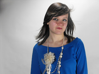
Kelly and I used this light set up to take pictures for our digipak. A white sheet was hung as a backdrop, the lights were placed in the positions as shown above and a fan was placed in front of Kelly and directed at me, as Kelly took the photo's.
This is an example of the 3-point lighting:

We then tested how the image would look if the 'fill' light was dimmed or turned off.
It does give quite a good effect, especially if you are trying to portray the person in the picture to have two sides to them, also it gives a nice fading effect without using any editing tools in photoshop.
This is an example of the 'fill' light turned off:

This is an example of a single spotlight, pointing directly onto me:
It gives a good performance effect, this is why we are going to use this type of lighting in a lot of our photo's as we are trying to portray a solo-artist.

Friday, 12 February 2010
The making of the collage for one of the inlays for the digipak
All of the images are imported onto corel draw, placed randomly and then some are rotated.
1. 2.
2.
 3.
3.

4.

5.

9.

1.
 2.
2. 3.
3.
4.

5.

6.

7.


7.

9.

Tuesday, 12 January 2010


Tuesday, 29 December 2009
Research into the process that companies use in the media industry to promote their product
1. Firstly they need to know their target audience inside out.
As we are doing this for an A-level peice we've only come up with a few things but if it was a real company we were working for we would need to know everything about our target audience.

As we are doing this for an A-level peice we've only come up with a few things but if it was a real company we were working for we would need to know everything about our target audience.
- We have chosen the target audience of 16-25 year olds.
- They like a very wide range of music genres, however we have decided to focus on the pop music genre as that is the most mainstream.
- The main way in which they buy music is by downloading it from various websites or itunes etc. This is why we will be putting on the poster that the digipak will be available to download (even the features on the DVD as part of it).
2. Secondly they would research into what they need to promote.
- As part of the A-level peice we will be making a music video, digipak and poster as part of a promotional package.
Also one of the things they use is an equity pyramid to help build up the overall product.
There are many different types of equity pyramid. I have found an example of one from this website: http://www.qsaresearch.com/images/equity.pdf

The overall equity when promoting an artist will include a mixture of the artists equity and the record company's etc. equity.
3. Finally they need to bring step number two to life. This would involve generating awareness, driving appeal and distribution. Also they would need to make sure they were using holistic communication to ensure that the message they are trying to get across to the target audience is consistant and uses a range of online and offline marketing communications.
- If we were a company we would be using marketing techniques on the internet through websites such as itunes, amazon, store websites and the record labels website. Also we would be using marketing techniques offline including, posters which can appear on bus shelters, billboards, in cinemas, in magazines etc.
This process also need to work backwards as well because the steps need to relate to the one before for example, how the company promotes a product will need to partly relate to what the actual product is and then both what the product is and how it is promoted will need to relate back to the target audience.
Tuesday, 15 December 2009
Experiments with Corel Draw & Corel Photo Paint
For the picture below I firstly used Corel Photo Paint to crop the picture - this was done by selecting image in the taskbar and then selecting cutout, from there I zoomed into the picture so that it was showing the pixels as quite large so that when I highlighted around the image it would be accurate. After this I then copied it into Corel Draw and positioned it in the centre of the page. In the final piece we will be using Corel Photo Paint to crop the photo's Also in the final piece we will be using Corel Draw to layer each cover of the digipak and then layer the poster with images in text.


The picture below is experimenting with Corel Draw for the back cover of the digipak to pratice layering the song titles onto a piece of paper to see how it looks. In the final piece this part of the back cover will be slightly smaller to make room for other details and it will also be in colour.

Monday, 7 December 2009
Planning for the poster and further research
Firstly we thought we would do some audience research into posters to see what sort of thing makes a poster attractive and eye-catching, and would persuade the target audience to go to the tour or buy the digipak.
We asked a range of people from our selected target audience of 16-25 year olds (and a few people below and above that age group as we'd like to broaden the target audience as well) to answer 11 questions about the following 3 posters advertising an artists tour.
Layout design 1 for the poster:

Layout design 2 for the poster:

We asked a range of people from our selected target audience of 16-25 year olds (and a few people below and above that age group as we'd like to broaden the target audience as well) to answer 11 questions about the following 3 posters advertising an artists tour.


 I have chosen 3 female artist's tour posters because our artist is female and I have also chose 3 different layouts and ways of presenting an artist to see which one is preferred.
Below I have summarised each answer by selecting common words and phrases used in the answers given by 15 members of our target audience. (if we were a real company our sample size for the questionnaire would be a lot larger)
1. What is the first thing that catches your eye..?
on Lady Gaga's tour poster = The writing and Lady Gaga with the metal ball around her.
on Britney Spears tour poster = Britney Spears.
on Mariah Carey's tour poster = Mariah Carey, the old fashioned microphone and the writing.
It seems like the first thing that catches peoples eye is the picture and any writing that may appear on the poster. This suggests to me that our poster should have quite a large image and make atleast the artists name and what we are promoting in a large font.
2. What would your first reaction be if you saw it as an advertisement?
for Lady Gaga's tour poster = Interesting, weird, too much writing.
for Britney Spears tour poster = Easy to read, attractive, circus theme suggests it will be fun.
for Mariah Carey's tour poster = The picture is too over the top, whole thing is simple and well laid out.
Peoples reaction to posters seem to be about what the picture looks like (interesting, weird, the theme etc), how the layout is presented and how much writing there is because if there is too much writing it can put people off a poster. This suggests we will need to keep our poster quite simple, easy to read with not too much writing and to make the picture interesting.
3. Would you be persuaded by the poster to go to their tour?
for Lady Gaga's tour poster = 8 Yes, 2 Maybe, 5 No
for Britney Spears tour poster = 7 Yes, 0 Maybe, 8 No
for Mariah Carey's tour poster = 5 Yes, 1 Maybe, 9 No
Most of the people who said Yes/No said it because they disliked or liked the artist so this suggests that if our artist already had a fanbase then they would happily buy tickets for or buy what was being promoted.
4. If you were persuaded to go to the tour how did it pursuade you?
on Lady Gaga's tour poster = They like lady Gaga/her music, VIP tickets were attractive, interesting.
on Britney Spears tour poster = They like Britney Spears and the circus theme suggested it would be fun.
on Mariah Carey's tour poster = 'Intimate shows' & there were only 4 makes it seem special, easy to read.
The most common answer for what would pursuade people to go to the tour would be because of who the artist is or any endorsements that appear on the poster for example VIP tickets and 'Intimate shows'. This suggests that we would need to put some sorty of endorsement on the poster and maybe portray the artist as quite big but they haven't been to the UK yet.
5. What do you like the most about each tour poster? (not including liking the artist but can include how they are presented etc.)
Lady Gaga's tour poster = Picture is weird and interesting, all the information is on the poster and it is different - which is what Lady Gaga is about.
Britney Spears tour poster = Britney is attractive, the cicus theme, and simple.
Mariah Carey's tour poster = Use of an old prop (microphone), all information is there - not too complicated and straight to the point.
Overall people liked something to do with the picture on the poster for example the artist or the theme, and the information that is on there. This suggests we need to put emphasis on the image we use for the poster and make it quite interesting to look at, also we need to put a suitable amount of information on there - not too much & not too little.
6. What do you dislike the most about each tour poster? (not including disliking the artist but can include how they are presented etc.)
on Lady Gaga's tour poster = Too much information, dull, dark and the picture could have been bigger.
on Britney Spears tour poster = Not enough information.
on Mariah Carey's tour poster = Doesn't say where the tour is held and needs more colour.
The most common dislike of the posters was about how much information was on it and how there isn't much colour used on 2 of the posters. This suggests that we need to make sure we put a suitable amount of information on the poster - not too much and not too little, and also we need to make sure it is quite colourful because the eye is attracted to colour and it would make the poster more interesting.
7. In each of the posters which aspect of them did you spend the most time looking at?
on Lady Gaga's tour poster = Some aspect of the picture including Lady Gaga and the writing.
on Britney Spears tour poster = Britney Spears.
on Mariah Carey's tour poster = Mariah Carey and the writing on the poster especially 'Don't miss these 4 intimate shows'.
People tended to spend the most time looking at the picture or the writing in each of the posters. This suggests to us that we need to make the picture look very interesting to look at and attractive to the target audience, also we need to make sure we put a suitable amount of information on the poster - not too much or too little so the target audience wouldn't be put off it.
8.Out of the 3 posters I've sent in this mail which grabbed your attention the most and why do you think this?
- 6 people thought Britney Spears' poster grabbed their attention the most because it was attractive, simple, easy to read, colourful and to the point.
- 9 people thought Lady Gaga's poster grabbed their attention the most because it was cool, modern, different, 'out there' all the information was there and it stood out the most.
Overall it seems that people are attracted to posters that are different to what is already out there, attractive, simple, easy to read, colourful, to the point, and modern. This suggests when making our poster we need to consider all of these things.
9. On posters do you read all of the information on them or just focus on a few aspects?
- 13 people focus on a few aspects only.
- 2 people focus on everything.
This suggests that most people focus on a few aspects, this means that we should only put on the poster the things that people focus on the most rather than putting too much information on there.
10. If you only focus on a few aspects, please state what they are and what interests you about them?
A picture of the artist and their name, date of event, venue, large bold writing, and maybe a logo.
This suggests we will need to include all of these aspects in our poster but adapt them to suit a promotion for a digipak.
11. Would you prefer it if a tour poster/CD advertisement had a lot of information on it or a little information on it? (For example all of the tour dates, all of the ticket information, prices, offers, date the product/tickets go on sale etc.)
There needs to be information on it but it needs to be to the point - nothing too complicated, dates, costs, offers, title, website address, locations, and maybe a summary sentance selling the product?
This also suggests we need to include all or most of these aspects in the poster and apply it to a promotion for a digipak.
In conclusion we will need to focus on making an interesting and different image of the artist so people will notcie and pay attention to our poster. Also we will need to make sure we put a suitable amount of information on the poster which includes, artists name, that it's a digipak promotion, release date of digipak, endorsements of some sort, website address, maybe the cost of the digipak but no more information than that.
Research conducted by various advertising companies have found that in western European countries, the USA and Australia etc. people tend to read media texts from:
- left to right
and - from top to bottom
Therefore this suggests that the key messages that the media text need to communicate to the target audience would generally be portrayed from the top left corner of the page moving diagonally downwards to the right bottom corner as this is the way that an audience are most likely to read the media text.
Planning for the Poster
The top key messages that need to be communicated to our target audience in the poster are:
- What the product is - this is a key aspect we need to communicate because it is the purpose of the poster as this is the thing we need to promote and advertise in order for people to recognise it and purchase it. - A digipak promotion.
- The artist - this needs to be communicated because it will give the target audience a reason to be interested in the poster and essentially the product as well. Not only would it catch the eye of people who already are a fan but it will need to be able to promote the artist as well to broaden the fan base. - Amanda Kaletsky.
- When the digipak is available to purchase (a date or if it's already out) - this is so the target audience will know when they will be able to purchase it if they wish to do so. - 22nd February 2010 or 'Out Now' will be when our digipak will be available to purchase.
- Where the audience will be able to get the digipak from - this is important because if the artist is new and is starting off with only having their album in a few selected stores then it makes it easier for the target audience to be able to purchase it as they would know where to get it from. - Taking in to consideration our target audience and the 21st century, downloading is very popular so we would make the whole digipak (including the DVD's features as well as the tracks from the CD) available to download, purchase online and have the digipak delivered, as well as purchase from various stores.
- A special feature of the digipak - this would make it even more appealing to the target audience. For example if it was a limited edition or a special edition digipak this would be more likely to persuade to target audience to buy the product because it seems more exclusive to them. - We may also state that the artist is being introduced to the UK & has been a huge success already in the USA.
Layout design 1 for the poster:

Layout design 2 for the poster:

Monday, 23 November 2009
Risk Assessments
- Tripping over the tripod can be a hazard so we will have to be careful when walking near it.
- When filming in the theatre we need to make sure the female singer is in a position where she won't be blinded by the spotlight.
- When filming the picture burning we will have to be careful about the fumes it will let off so and also we need to be wary about things around us so they don't catch fire. We are going to do this outside because it is safer and there won't be a chance of us causing damage to our surroundings.
- Whilst filming the male (Tom Bee) pushing female 1 (me) on a swing we have to make sure the camera or the person filming (Kelly) won't get kicked and also we need to make sure I don't fall off.
- When filming in the outdoors we need to be aware of our surroundings and watch out for any dogs which may run at us or anything/anyone else who may disrupt filming.
- When the male (Tom Bee) is using the gym equipment he needs to make sure that firstly he knows the correct way to use it and secondly doesn't push himself too hard and injure himself.
- When running in the field, in a house and up a street we need to make sure there aren't any potential slipping hazards in the 'running pathway' and also we won't run very fast.
- When holding the rose we will have to make sure we are careful not to prick ourselves on the thorns.
- Finally when throwing the microphone stand we will have to make sure the microphone isn't still attached to it so it won't get damaged, also we will have to pick it up more or less straight the way so people won't trip over it.
Sunday, 22 November 2009
Shooting Schedule for music video and pictures for didgpak/poster
Filming for the music video;
Day One; - (completed)
Location: Tom bee's house & Winchester Road
Props: Paper saying 'Everything Lies' - to stick on road signs whilst filming.
Shot Numbers: 67, 69, 71, 73, 75, 77, 79, 80, 81, 82 84, 85, 86, 88, 90, 92, 94, 123
Day Two; - (completed)
Location: The college theatre - need to see when it is free & we need to book it
Props: Microphone, Mic stand, drums.
- A lighting schedule will also be produced for when we film in the theatre.
Shot Numbers: 1, 6, 14, 17, 18, 22, 23, 24, 25, (26, 27, 28, 29 filmed continuously) 31, 33, 35, 37, 38, 40, 42, 43, 59, 60 ,61, 62, 63, 64, 65 ,66, 68, 70, 72, 74, 76, 78, 87, 89, 91, 93, 95, 98, 99, 100, 101, 102, 103, 104, 105, 106, 107, 108, 109, 111, 112, 113, 114, 115, 119, 120, 121, 122, 123, 124, 125, 126, 127, 128, 129, 130, 131, 132.
Camera shots filmed of the Female singer (me) performing from the same positioning and each shot type they will be from:
Extreme close up of lips: 26, 27, 28, 29
Close up: 14, 17, 33, 38, 70, 78, 89, 93, 107, 120
Medium close up: 1, 25, 42, 60, 62, 65, 95, 98, 112, 129
Medium shot: 6, 24, 35, 47, 61, 63, 74, 91, 99, 103, 126,
Medium-long shot: 23, 37, 43, 64, 66, 130, 132
Long shot: 18, 22, 68, 72, 87, 114, 124
Shots of Female 2 (Kelly) in the theatre: 96, 99, 101, 106, 114, 119, 125
Day Three; - (completed)
Shots of the Male in the theatre: 97, 102, 104, 108, 111, 115, 121, 128, 131
Shots of just the audience (without male): 100, 113,
Day Four; - (completed)
Location: Drama studio - need to see when free & need to book it
Props: Green fabric for greenscreening & digital camera to take a picture before filming one perticular shot - not really props but we need them
Shot numbers: 3, 12, 77, 80, 81, 116
Camera shots filmed from the same position: 3 & 116
Day Five; - (completed)
Location: Countesthorpe/Leysland field & outside the entrance to design
Props:
Shot Numbers: 26, 27, 28, 30, 32, 34, 36, 39, 41, 44, 45, 46, 110, 117
Day Six; - (completed)
Location: Countesthorpe gym - need permission to film whilst people are in there - we need things going on in the background anyway so we don't need an empty gym
Props: Gym equiptment, bench
Shot Numbers: 13, 15, 16, 50, 51, 53, 54, 55, 56, 57, 58, 118
Day Seven; - (completed)
Location: Kelly's house
Props: Photo's, letters, bed, mirror, make-up
Shot Numbers: 5, 7, 8, 9, 10, 19, 20 ,21, 83
Still images needed for our music video:
Shots 2, 3, 4, 11 and 116 all will need pictures as the full shot or the background.
Still images for the digipak & poster;
Day One; - (completed)
Location: Tom bee's house & Winchester Road
Props: Paper saying 'Everything Lies' - to stick on road signs whilst filming.
Shot Numbers: 67, 69, 71, 73, 75, 77, 79, 80, 81, 82 84, 85, 86, 88, 90, 92, 94, 123
Day Two; - (completed)
Location: The college theatre - need to see when it is free & we need to book it
Props: Microphone, Mic stand, drums.
- A lighting schedule will also be produced for when we film in the theatre.
Shot Numbers: 1, 6, 14, 17, 18, 22, 23, 24, 25, (26, 27, 28, 29 filmed continuously) 31, 33, 35, 37, 38, 40, 42, 43, 59, 60 ,61, 62, 63, 64, 65 ,66, 68, 70, 72, 74, 76, 78, 87, 89, 91, 93, 95, 98, 99, 100, 101, 102, 103, 104, 105, 106, 107, 108, 109, 111, 112, 113, 114, 115, 119, 120, 121, 122, 123, 124, 125, 126, 127, 128, 129, 130, 131, 132.
Camera shots filmed of the Female singer (me) performing from the same positioning and each shot type they will be from:
Extreme close up of lips: 26, 27, 28, 29
Close up: 14, 17, 33, 38, 70, 78, 89, 93, 107, 120
Medium close up: 1, 25, 42, 60, 62, 65, 95, 98, 112, 129
Medium shot: 6, 24, 35, 47, 61, 63, 74, 91, 99, 103, 126,
Medium-long shot: 23, 37, 43, 64, 66, 130, 132
Long shot: 18, 22, 68, 72, 87, 114, 124
Shots of Female 2 (Kelly) in the theatre: 96, 99, 101, 106, 114, 119, 125
Day Three; - (completed)
Shots of the Male in the theatre: 97, 102, 104, 108, 111, 115, 121, 128, 131
Shots of just the audience (without male): 100, 113,
Day Four; - (completed)
Location: Drama studio - need to see when free & need to book it
Props: Green fabric for greenscreening & digital camera to take a picture before filming one perticular shot - not really props but we need them
Shot numbers: 3, 12, 77, 80, 81, 116
Camera shots filmed from the same position: 3 & 116
Day Five; - (completed)
Location: Countesthorpe/Leysland field & outside the entrance to design
Props:
Shot Numbers: 26, 27, 28, 30, 32, 34, 36, 39, 41, 44, 45, 46, 110, 117
Day Six; - (completed)
Location: Countesthorpe gym - need permission to film whilst people are in there - we need things going on in the background anyway so we don't need an empty gym
Props: Gym equiptment, bench
Shot Numbers: 13, 15, 16, 50, 51, 53, 54, 55, 56, 57, 58, 118
Day Seven; - (completed)
Location: Kelly's house
Props: Photo's, letters, bed, mirror, make-up
Shot Numbers: 5, 7, 8, 9, 10, 19, 20 ,21, 83
Still images needed for our music video:
Shots 2, 3, 4, 11 and 116 all will need pictures as the full shot or the background.
- For shots 2 and 4 the still images are the same - the picture was taken & edited (cropped and tinted black & white) on the 23rd of November 2009.
- For shots 3 and 116 the background still images are the same - the picture was taken & edited (cropped and tinted black & white) on the 23rd of November 2009.
- The picture need for shot 11 will be taken just before we film shot 12 as they follow on from each other & it will be easier to get the positioning right. - the picture & the shot following it were both taken & filmed on the 2nd of December 2009.
Dates of when filming has taken place:
- 24th November - completed all of day 4's filming - couldn't do days 1,2 or 3 because of the weather and the theatre was booked.
- 26th November - completed shots 67, 69, 71, 73, 75, 77, 79, 80, 81, 82 84, 85, 86, 88, 90, 92, 94 from day 1 of filming - need to re-shoot shot number 92 because we decided we need to cover up another sign as that was standing out more than our sign & we need to re-do the poster because the wrong phrase was used. We will film shot 92 on the day we film when we start filming the shots in day 5 in our shooting schedule.
- 2nd December - completed shots 5, 7, 8, 9, 10, 11, 12, 13, 15, 16, 50, 51 & 57 - most of the filming for day 7 is completed and part of day 6 is completed.
- 3rd December - completed shots 52, 53, 54, 55, 56, 58 & 118 - all of the filming for Day 6 is completed.
- 9th December - completed shots 32, 34, 36 & 110.
- 10th December - completed shots 26, 27, 28, 30, 82, 84 & we re-shot shot number 92 which was successful..
- 16th December - completed shots 39, 41, 117
- 18th December - completed shot 123
- 7th January - completed shots, 1, 6, 14, 17, 24, 25, 33, 35, 38, 42, 60, 61, 62, 63, 65, 70, 74, 78, 89, 91, 93, 95, 103, 107, 112, 120, 129
- 15th January - completed shots, 100, 104, 108, 111, 113, 115, 121, 128
- 29th January - completed the rest of Day 2 filming
- 4th March - completed the rest of Day 3 filming
- 11th March - completed 4 shots in the place of shots 19, 20 & 21 --> Day 7 of filming is completed :) - we changed these shots because we don't have enough time to experiment with split screen editing so we have just added some more narrative into the music video and the shots will be on the beat.
All filming is finished :D
Still images for the digipak & poster;
- Close up/medium-close up of female singer (me) for the front cover - may be taken before or after we have filmed in the theatre. (day two)
- A piece of lined paper will be scanned onto a computer for the base of the back cover - will be scanned when we scan the storyboards and digipak/poster sketches onto the computer.
- Take a picture of a rose when we are filming with the rose (day five) - for the back cover.
- December 15th - lined paper was scanned onto the computer
- December 16th - The picture of the rose was taken (for the back cover) and the picture of the artist with the rose was taken (for one of the middle covers) - it was altered slightly.
- January 5th - Pictures were taken of me holding a rose - for the digipak.
- January 8th - A lot of pictures were taken of me (the singer) whilst "performing" & also a few other different settings - all for the digipak and poster - we will need to choose which ones we will be using.
- February 24th - we set up a proper photoshoot in the media room with three point lighting and a white/cream backdrop and took quite a few photo's. These will be for the collage, poster and maybe a middle cover of the digipak.
- March 9th - Pictures were taken of me for the inlay collage for the digipak.
Wednesday, 18 November 2009
Planning for the Digipak
Kelly and I have come up with the following overall ideas for our digipak;
The front cover - Extreme close up/close up of female.
Middle left - Female holding last petal - sitting in a field.
Inlay - Collage or a single rose
Middle right - Female leaning against a wall holding a rose - bright white light behind her OR a collage
Back cover - the background will be a letter - lined paper - the song names will be in a hand-writing type font to make it look like she has hand-written the back cover - makes it more personal.
Sketches and final ideas for the digipak will be scanned in soon.
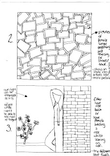
Basic Ideas for one of the middle covers:

Audience feedback on which middle cover they preferred & why:
Ideas for the inlay:

Audience feedback on inlay & other comments (some are repeated because people said the same things):
 Audience feedback on which basic design they preferred for the back cover & other comments:

The front cover - Extreme close up/close up of female.
Middle left - Female holding last petal - sitting in a field.
Inlay - Collage or a single rose
Middle right - Female leaning against a wall holding a rose - bright white light behind her OR a collage
Back cover - the background will be a letter - lined paper - the song names will be in a hand-writing type font to make it look like she has hand-written the back cover - makes it more personal.
Sketches and final ideas for the digipak will be scanned in soon.
Basic Ideas for one of the middle covers:
Audience feedback on which middle cover they preferred & why:
- Number 2 - looks interesting.
- Number 3 - more designs.
- Number 2 - tells audience more about the artist.
- Number 3 - attracts attention.
- Number 2 - raw - how you would expect to see artist - has meaning.
- Number 3 - looks good.
- Number 2 - I like it.
- Number 3 - shows mood.
- Number 2 - almost like scrapbook - goes with back cover of lined paper.
- Number 2 - it's different.
- Number 3 - like folwers and think it will look good.
- Number 3 - looks better.
- Number 3 - likes idea of bright light - more simple.
- Number 2 - looks good - change from big pictures on front etc. - different.
- Number 2 - different - so many effects and meanings.
- Number 1 - photo being dropped in storyboard - reflects story - going through pics etc. - people can relate to it - goes with the song.
- Number 2 - pictures of the singer being a singer.
We have decided to select design 3 to develop for one of the middle covers because even though design 2 was more popular we selected that to be a design for the inlay instead, and the middle covers will have a design which involved a rose - so we selected design 3 which was the 2nd most popular to develop.
Developed ideas for one of the middle covers:
Audience feedback on which middle cover they preferred & why:
- Number 1 - closer - looks good.
- Number 1 - better.
- Number 2 - looks better - further away - see more of picture - know what they're looking for.
- Number 1 - better as a close up photo.
- Number 1 - closer - looks better.
- Number 1 - fills more space - more detail - see rose better.
- Number 1 - more detail - fell more involved with picture.
- Number 1 - closer - see more/more detail.
- Number 1 - fills more space.
- Number 1 - fills space.
- Number 1 - sort of close-up see person better.
- Number 1 - bigger, eye-catching.
- Number 2 - see more - more detail.
We have decided to choose design 1 for our final design because it was the most popular with the target audience and there would be less space left around the image of the artist for the audience to get distracted by.
Ideas for the inlay:
Audience feedback on inlay & other comments (some are repeated because people said the same things):
- Before the idea of the collage:
- A black background with a bright pink/red rose would look good.
- A black background with a bright pink/red rose.
- Rose is good.
- Rose is a very nice idea - goes well with the theme. After the idea of the collage:
- A collage would be a good idea - better than the rose.
- A rose - it matches the back cover & maybe middle cover.
- A rose - so it matches the rest of the covers.
- The rose - it goes with the music video and rest of the album.
- Collage - about female singer - tells audience about what she did on tour - interests audience.
- Collage - you would still be able to see it when the CD/DVD is in place.
- Collage - is a good idea.
- Collage - would look good with all the different pictures of the artist - would look good if you tint the picture with just one colour or something.
- Collage - fills page - fuller - more meaning.
- Collage - good to see all of the differet pictures.
We have decided to have design 2 for the inlay because not only was it quite popular, it also links in with the back cover as a kind of scrap book image to make it more personal. Also for the two middle covers we are having images with roses in so we thought we would do something different for the inlay to keep the audiences attention.
Basic Ideas for the back cover:
Audience feedback on which basic design they preferred for the back cover & other comments:- Number 1 - good basis for back cover - unique.
- Number 1 - different from the others - more like a back cover.
- Number 1 - simply tells you the track list etc.
- Number 1 - simple - easy on the eye.
- Number 1
- Number 1 - just like it - more feminine.
- Number 1 - tells everything you need to know.
- Number 1 - like it - paper idea is good.
- Number 1 - simple but effective.
- Number 2 - see face better & the artist is shown
- Number 2 - see face of singer - more connective to them.
- Number 3 - artist shown & space for tracklist.
- Number 3 - not bland - nice design.
- Number 3 - cause I said.
- Number 1 - like picture - personal.
- Number 2 - looks active - interesting.
- Number 2 - looks most appealing.
- Number 1 - different - not a picture of artist.
- Number 1 - different - graphics could be put on - sketches.
- Number 1 - funky
We have decided to develop ideas for design number 1, firstly because it was the most popular design when we asked people for feedback on which they preferred/looked better as a back cover and also it is the one which can be developed quite a lot.
Developed Ideas for the back cover:
Audience Feedback on which developed idea they liked, why and other suggestions if any:
- Number 1 - like the rose & doodles - people can relate to doodles - more personal. Also you could put more doodles on it or add the fluffy pen to this one.
- Number 1 - like the rose.
- Number 1 - like the rose.
- Number 1 - shows female singer on a personal level.
- Number 1 - take more seriously.
- Number 1 - more feminine.
- Number 1 - suits the mood of the song.
- Number 1 - pretty flower (rose).
- Number 1 - more mature - symbolises love.
- Number 1 - flower more effective than fluffy pen.
- Number 1 - rose = pretty.
- Number 1 - love song & rose go together.
- number 1 - more design, delicate.
- Number 1 - looks better
- Number 1 - better.
- Number 1 - reminds them of love & it looks pretty.
- Number 2 - more realistic.
- Both - try to combine the ideas.
- Number 1 - flower & heart are prettier.
- Number 2 - fluffy pen - looks fun.
- Number 1 - goes with story & music video.
We are selecting design number 1 to have as our final design for the back cover of the digipak because it was the most popular design with our target audience.
Subscribe to:
Posts (Atom)